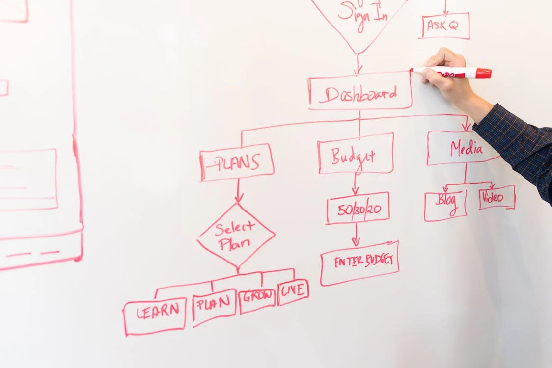
Financial planning is of utmost importance in the constantly evolving business landscape. Some innovative companies are engaging diagrams and other visual tools to connect complicated financial data with clear, actionable insights.
Effective utilization of diagrams allows these businesses to spot trends, optimize budgeting allocations, and forecast more accurately.
This article will elaborate on how companies can use diagrams to ensure financial success.
Visualizing Data Trends
Data trends hold lots of insight into the company's growth trajectory, market performance, and emerging risks or opportunities. While traditional tables and spreadsheets inform, spotting trends instantly takes time.
Diagrams such as line charts, heat maps, and waterfall charts turn such numbers into easily interpretable visuals, making it easier for businesses to identify patterns and plan their strategy.
Line charts convey trends in revenue or costs over various points in time. You can choose heat maps on Miro's diagram templates to visualize a set of performance measures over any management aspect, helping your organization put together a rough analysis of which set of departments and product lines require attention and which are thriving.
Waterfall charts are becoming increasingly popular among financial analysts to show incremental effects contributing to profit and those drawing resources from profit.
Waterfall charts let one label income and expense categories as they contribute or detract to profitability step by step. This helps set more targeted budgets and operational shifts.
Enhancing Budget Allocation
Diagrams provide a more visual way of dispersing resources based on need, performance, or return on investment (ROI).
Pie charts, tree maps, and bar graphs are examples of diagrams that make it easier for organizations to see where budget money is allocated to analyze whether it is being appropriately distributed among various projects or departments.
- Pie Chart and TreeMap Displays of Departmental Budgets: Some organizations use pie charts to allocate and overview department budgets and clearly show which departments incur the highest costs or investments.
Then, there are tree maps that visualize the nested subcategories inside significant categories so that companies can track spending from both macro and micro perspectives.
- Comparative Bar Graphs for Tracking ROI: Comparative bar graphs for ROI analysis across departments or campaigns allow finance teams to see which investments quickly deliver the most significant returns.
This attachment of value is handy for companies with multiple product lines or initiatives because such products allow for prioritizing high-ROI projects to minimize expenditure on something that does not return value.
Creating Financial Projections and Scenarios
Forecasting diagrams, like predictive graphs and sensitivity analysis charts, enable businesses to visualize different possible futures. Such visualization allows companies to make moves beforehand to remediate variances of expected value.
Sensitivity analysis diagrams allow businesses to adjust the variables and visualize the underlying financial template.
For example, through changes in sales growth rates or interest, finance teams can prepare for best-case, worst-case, and moderate cases to support an adaptive approach to budgeting.
In predicting revenue growth and cost changes over time, tech-based companies increasingly use predictive modelling and multi-line graphs based on historical data. Using such tools helps with a more precise revenue forecast, which allows for appropriate scaling of content investments or subscriber acquisition costs.
Advanced Reporting and Real-Time Dashboards
Companies increasingly turn to interactive dashboards and real-time reporting to make rapid decisions. Interactive charts allow users to easily interact with the data, making it exceedingly easy to focus on specific areas. Live and dynamic reporting helps the financial roles recognize and act upon issues as they arise, maintaining flexibility in financial planning.
Real-time dashboards allow companies to track KPIs, for example, cash flows, revenues, and expenses, with the help of dynamic bar graphs, pie charts, and gauges. Companies can update operational budgets and marketing spending in real time because the information is continuously updated based on live data.
The Role of AI in Automated Diagram Creation for Financial Planning.
Artificial Intelligence (AI) is bringing a sophisticated new dimension to financial planning by providing functions for automatic diagram creation from live data feeds. An AI algorithm can identify patterns in the data, automatically generate predictive models, and recommend the most appropriate visualizations.
AI-powered financial planning tools can analyze historical data to build automated forecasting diagrams so that businesses visualize future revenue, costs, and cash flow. For instance, AI-anchored facilitates real-time forecasting updates, furthering financial planning accuracy and freeing the finance team from other resource-consuming manual functions.
Some machine learning algorithms can spot variations from a given pattern in financial information and present this using colour-coded visuals and alerts. Companies such as Walmart employ these kinds of tools, indicating specific trends in sales data that allow finance teams to make prompt corrective changes.
Endnote
Innovative companies can leverage diagrams to turn complex financial data into easy-to-understand visuals that enhance data comprehension, budgeting accuracy, and strategic planning.
From predicting the future to tracking KPIs in real-time, these visual tools bring the financial health of organizations into clear view and permit well-informed and timely decision-making.
Introducing AI and real-time dashboards into financial planning allows for an even more sophisticated and dynamic application of diagrams, giving businesses the insight needed to thrive in a highly competitive market.


